Dark vs Light Mode
Dark mode is a display setting for user interfaces, such as a smartphine or laptop.
This means that, instead of te default dark text showing up against a light screen (known as "Light Mode", a light colour text (white/grey) is presented against a dark or black screen.
Light mode, however, is the default setting for most phones and apps.
Dark mode can also be known as:
- ☾ Black Mode
- ☾ Dark Theme
- ☾ Night Mode
- ☾ light-on-dark
The idea behind dark mode is that it reduces the ligth emitted by device screens while maintaing the minimum colour contrast ratios requierd for readability.
Both iPhones and Andriod handsets offer system-wide dark modes. However, you will still need to set up dark mode on individual apps.
Some PC operating systems offer dark mode too, enabling you to set it up on your desktop or laptop.
So, the big question: is it time to go to the dark side?
Dark Mode explained
Dark mode is nothing new. If you’re old enough to remember Teletext and Ceefax, you’ll recall cyan or yellow text on a black background as you squinted at the TV to read the weather forecast.
Computers screens originally used what we now call dark mode, because of the capacities of the cathode-ray tubes used several decades ago. But in a bid to encourage people who weren’t programmers to use computers, interfaces were gradually adapted to resemble paper – i.e. black text on white paper.
The science behind dark mode is still a little shady, with lots of conflicting views and evidence as to its benefits. Some experts say it’s easier and healthier to read text against a dark background as it reduces eye strain, while other studies arrive at the opposite conclusion.
There’s also a debate about whether dark mode can make your smartphone battery last longer.
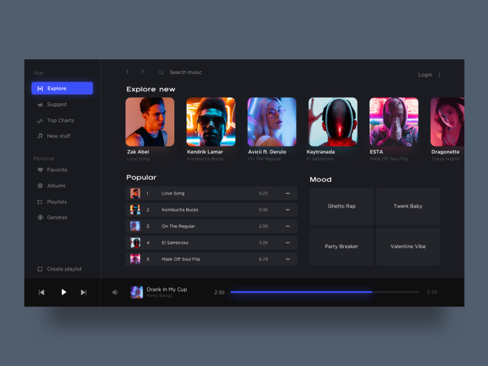
Many mobile users simply think dark mode looks more slick. And some apps, most noticeably Spotify, have always leaned to the shadier side of the colour spectrum.
Advantages of Dark Mode
☾ It’s better for low-light settings – so you can use it in bed without keeping your partner awake or in the cinema without disturbing other people
☾ There will be less ‘blue light’ emitted from your phone – which can keep you awake if you use your phone before you go to bed
☾ Can use less energy so your phone battery will last longer
☾ Can potentially reduce eye strain and dry eyes in low-light conditions
☾ Some experts say dark mode can help people with light sensitivity or visual impairment.
Disadvantages of Dark Mode
☾ Light-against-dark is not always better for eye strain – text can appear washed out, increasing eye fatigue
☾ Can be challenging to read long pieces of content or text in dark mode
☾ Light text on a dark background can be difficult to read in a well-lit sunny room
☾ If you have a phone with an older LCD screen, dark mode won’t really save your battery. You will need a OLED (organic light-emitting diode) screen for this to be the case.
For Developers
Dark theme is one of the most requested features over the past few years. Both Apple and Google made a dark theme an essential part of UI. Dark theme’s reduced luminance provides safety in dark environments and can minimize eye strain.
8 Tips when designing for Dark Mode
-
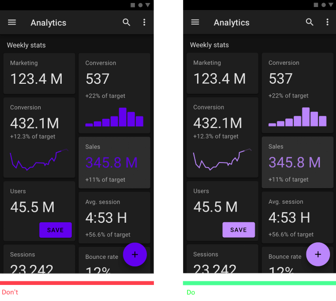
avoid pure black
A dark theme doesn’t have to be pure white text on a pure black background. In fact, that high contrast can be painful to look at.
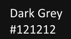
It’s safer to use dark gray as the primary surface color for components, rather than true black (#000000). Dark gray surfaces reduce eye strain — light text on a dark gray surface has less contrast than light text on a black surface. Dark gray surfaces can express a wider range of color, elevation, and depth because it’s easier to see shadows on gray (instead of a true black).
Material design recommends #121212 as dark theme surface color. -
Avoid using saturated colors on dark themes
A dark theme doesn’t have to be pure white text on a pure black background. In fact, that high contrast can be painful to look at.
It’s safer to use dark gray as the primary surface color for components, rather than true black (#000000). Dark gray surfaces reduce eye strain — light text on a dark gray surface has less contrast than light text on a black surface. Dark gray surfaces can express a wider range of color, elevation, and depth because it’s easier to see shadows on gray (instead of a true black). -
Meet accessibility color contrast standards
Ensure that your content remains comfortably legible in Dark Mode. Dark theme surfaces must be dark enough to display white text. Google Material Design recommends using a contrast level of at least 15.8:1 between text and the background.
Use color contrast tools to test contrast ratio. -
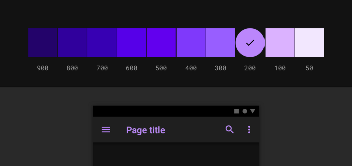
Use “On” colors for text
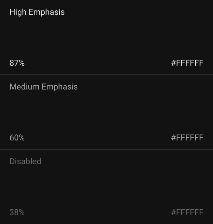
“On” colors are colors that appear “on” top of components and key surfaces. They are typically used for text.
The default “on” colors for a dark theme is pure white (#FFFFFF). But #FFFFFF is a bright color and it would visually “vibrate” against dark backgrounds. That’s why Google Material design recommends using a slightly darker white:
High-emphasis text should have an opacity of 87%
Medium emphasis text is applied at 60%
Disabled text uses an opacity of 38%.
Quick tip: Light text on a dark background can appear more bold than dark on light. That’s why you may want to use lighter font weights for dark mode. -
Consider the emotional aspect of your design
When it comes to designing a dark theme for an existing app, you probably want to communicate the same spectrum of emotions in dark mode. But it’s better not to do it. Why? Because
Colors are actually perceived differently depending on their background.
That means a dark theme just can’t communicate the same as the light theme. As a result, dark and light themes will always evoke different emotions. Instead of trying to fix that, it’s much better to take advantage of that for your product’s identity.
A dark mode does not (always) have to be derived from the existing light theme. -
Communicate depth
Similar to light theme design, when it comes to creating dark theme UI it’s essential to create hierarchy and emphasize important elements in your layout.
Elevation is a tool we use to communicate the hierarchy of elements.
In light mode, we use shadows to express elevation. The higher surface gets, the wider a shadow it casts. The same approach wouldn’t work in a dark theme — it’s hard to see a shadow against a dark background. It’s better to illuminate the surface of each level.
In dark themes built with Material, elevated surfaces and components are colored using overlays. The higher a surface’s elevation, the lighter that surface becomes.
Higher elevation, lighter surface -
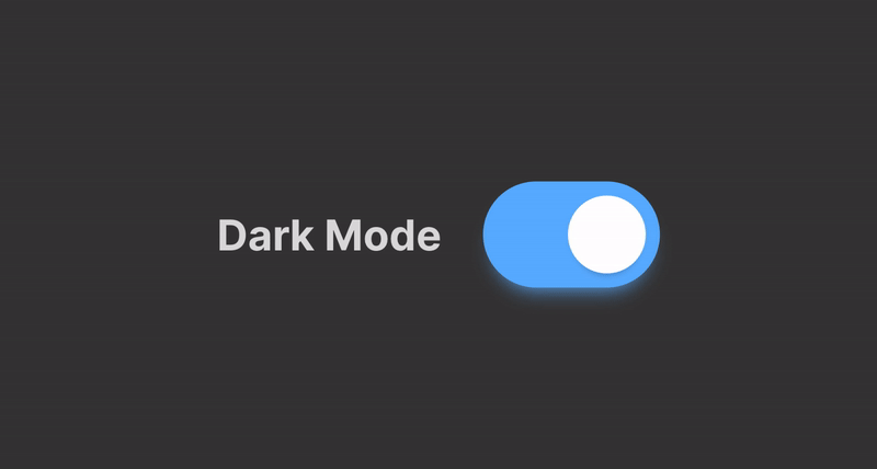
Allow users to switch from regular to the dark mode
It’s tempting to let the system decide when to on or off dark theme. However, this design decision can lead to bad UX. By doing that you’re taking control from the user and make the system decide for them.
That’s why it’s better not to use auto-enabling a dark theme. Allow users to turn dark theme on (or off) using UI control. Users should be able to opt into a mode manually, based on their own needs. You need to position and design the mode switcher. -
Test your design in both light and dark appearances
See how your UI looks in both appearances, and adjust your designs as needed to accommodate each one. Consider testing your product after sundown, with incandescent lighting.